#whitespace theory
Explore tagged Tumblr posts
Visit Tumblr Blog
Explore Tumblr blogs with no restrictions, modern design and the best experience.
Last Seen Tumblr Blogs


Fun Fact
Users from the US are the majority of Tumblr visitors.
Text
GUYS.
I JUST REALIZED SOMETHING.
SO YKNOW HOW THE WHITESPACE LIGHTBULB IS PROBABLY BASED ON THIS ROOM?

THAT’S THE ROOM WHERE THE VIOLIN IS RIGHT???
YOU KNOW WHAT ELSE THAT ROOM IS???
THE CLOSET.
WHITESPACE IS LITERALLY THE FREAKING CLOSET
#omori#omori sunny#omori sunflower#sunflower omori#Omori whitespace#whitespace theory#Sunny and Basil literally both hid a secret in the closet#that is so fucking gay#🏳️🌈🏳️🌈🏳️🌈#🌻🏳️🌈#Sunny omori
121 notes
·
View notes
Text
the theory that whitespace restores memories of erased timelines could be very funny if played right. Metal is experiencing every bad future on Little Planet at once mentally, Silver and Blaze have been hugging and crying for an hour now, and Knuckles got a peak into the Boom universe and is staring at the ground with a completely blank expression, wringing his hands
79 notes
·
View notes
Note
dy have any tips to make your art look less lifeless? I stare at my rendered digital art and everytime without fail i start to rot from the lack of soul in it
ok first of all, I think you might be judging your art too harshly. The only quite literal soulless art is AI art so as long as you create something, there's soul in it. But I understand what you mean. Honestly, I'm not sure if I'm best suited to answer this since it's something I struggle with myself, but since you asked me, here are my two cents on the matter
A lifeless look in your art may come from two places: a lack of skills or a lack of message/delivery
Skill-wise, there's a looot you can do and improve on : gesture, dynamic poses, more expressive faces, better color language, strategic line expression, shape language, using color theory to better express a certain mood of a piece etc.
i could go into detail for each point but it would take too long so I'll leave it up to you to google and research things on your own ( or you can shoot me another ask if you want me to yap about a certain technical approach and I'll gladly do so)
but honestly, these are just skills and tools that you master in time. A first step is to at least acknowledge their existence. I want to talk more about the second aspect of this issue: intention. The intention behind your art is more valuable than you think. Art can feel soulless if it doesn't send any message, if it's generic, if there's no emotion behind it or if there's nothing to be interpreted. I'm not saying all art should be super deep or profound to hold value of course, but i often feel like this is a rather neglected part when discussing art. We sometimes get so tied up in the technical aspects like rendering or anatomy but the truth is, a general audience (aka the people who will see your art) doesn't give a crap about the technicalities. They judge something at face value and the first thing they look for is the /message/. What is this painting about? Who or what did you draw? The second thing they will look for is connection. When they can relate to the emotion conveyed or the subject matter, the experience becomes more rewarding and engaging. The same applies to the artist. Creating something meaningful and personal often leads to a greater sense of accomplishment. Honestly, skill comes second.
Case in point: why does hyperrealistic art get shit on? It's very impressive technique-wise, yes, you can't deny the artist isn't skilled, but does it express something? Nope, they do the job of a printer which again,. it is impressive but not from an ~artistic pov, just from a skill pov. On the flip side, why do poorly drawn sob stories get so much attention and praise? Because the art triggered a certain emotion (that has overwritten an already untrained eye) and emotions are extremely powerful for humans as we all very well know and it basically makes them ignore or neglect the execution
So, my piece of advice is to draw something that has personal meaning /to you/, that ignites a certain feeling you can't shake ( it doesn't have to be something #deep or sad, laughter and joy are equally valuable so keep that in mind), a certain situation or scenario and I can guarantee your art won't feel as lifeless to you as before. To better express this idea of yours that you now possess, you can now think about the technical side of how you'd express it. For example:
~deliberately messy brushstrokes and textures -> create chaos.
~maybe you're feeling something lovely dovey and soft -> warm colors to express that + brushes with lost edges
~maybe you want to tell a story in a comic format -> focus on calligraphy; shaky lineart gives off the impression of vulnerability; leave whitespaces etc
~something funny? -> goofy facial expressions or lowkey downgrading the quality usually makes something funnier
~Colors ! colors ! colors !!! pretty self-explanatory blues and grays for depression pinks and rainbows for the happy ( or NOT if you're feeling adventurous winkwink)
BONUS TIP: hiding/blocking out/blurring the face of your subject makes the painting feel more immersive. The viewer can relate to the person you're drawing ( "oh he's just like me fr")
There are artists who are insanely skilled but make kinda "boring" art and then there are artists with cool ideas but with maybe an underwhelming execution.
Ultimately, it's a combination of BOTH awesome skills and intentions. Those are my favourite artists. When i find someone who draws something that makes me stare and wonder how tf they drew that while also appreciating how cool the concept is I knoww I hit jackpot. And if they draw fanart of my fave?? bonus points
okkkkkkkkk i yapped for too long sorttyyyyy hope it helped maybe idk
!!!!DISCLAIMER!!!! this is all my personal interpretation and how i view things I'm self taught I've never been to art school or taken any art classes so i might be completely wrong !! take everything with a grain of salt !!
#long post#ask iztea#art advice#eveything was pretty obv idt i said anything useful or new#tl;dr draw something that has meaning and use certain techniques to express that message wow#ask iztea: art talk
44 notes
·
View notes
Note
Hi! If you’re still doing the Q&A can you tell me about dreamlink technology? That sounds really cool
I'm always open for asks! I have been away for a bit due to some physical health problems, nothing too serious and I'm working on it. But I check my inbox semi-frequently and will answer asks when I have the time (such as now :D).
Okay, so Ad Infinitum is the newest WIP of mine, but that doesn't mean my brain hasn't done at least a little spinning of gears when it comes to worldbuilding and, in this case, sci-fi technologies.
Dreamlink, inspired (mostly in namesake*) by other similar concepts, is a technology in the sci-fi setting of Ad Infinitum that allows the user to control their dreams. (*Inspired by the dreamlink in Pokemon black/white (namesake only), and a little bit by the deep sleep/consciousness transfer technology in some of Scriptwelder's games)
When activated, before sleep, the user will be forced into a lucid dream dreamscape in which they have full control over said dream. In addition to this, the dreamlink console* can/will transmit and record data into/out of the dream, which allows the sending and receiving of messages/commands. (*In starships, the dreamlink console is built into sleeping pods(beds)/cryopods)
This technology is typically used in conjunction with cryostasis to not only allow the user to dream if they wish to, but to also allow the dreamer to still be in control/command of the outside world while in cryostasis. (In short, it allows people to always have lucid dreams, but also somewhat exploits peoples dreams so they never have to stop working :/)
You can, as the name would suggest, link dreams together if you want. Now this only works if both users are connected to the same dreamlink console which acts as a kind of server/database. ...do with that what you will.
Now, the biggest downside of this technology is it, of course, only affects creatures that can dream. Which not all species can, at least not in the setting of Ad Infinitum.
Another downside, albeit a niche one, is that if you do link your dream with someone else's, due to the nature of the technology they could kill you in the dream. Normally, this would wake one up. BUT, if you are in cyrostasis, this doesn't happen. The dreamlink does prevent pain, but not the shock, so... it isn't fun.
I haven't made lore of its invention, creator, use throughout history, or anything like that. I do know what it does and how it interacts with similar technologies (such as the aforementioned cryostasis).
Now, due to the hook and main story of Ad Infinitum, although Dreamlink is widely used among those who can use it, throughout the story it is one of many technologies whose existence is solely on the S.S. Whitespace. (In short, the story is about the exploration of scientific and mathematical theories concerning blackholes, whiteholes, wormholes, and parallel universes.)
I believe that is it for now. Anyone who wishes to ask me another or further questions is free to! ❤ I always love rambling about characters/lore.
2 notes
·
View notes
Text
yknow… fonts… careful arrangement of items…. ligatures…. css transformations…. html….. deliberate graphic design n 60:30:10 and color theory n accents…. the precision of a 10 stud wrap…. client objects…. the whitespace of a poem just like the whitespace of code…. word choice…. give me a second
2 notes
·
View notes
Text
Key Elements for Compelling Infographics: A Guide to Color, Clarity, and Data Presentation
Infographic Designs: Frequently Asked Questions Explained
1. What are the key elements that make an infographic visually appealing and effective in conveying information?
Key elements of an effective infographic include a clear and concise layout, balanced use of colors, legible typography, relevant visuals (like icons and images), and well-organized data. Effective infographics also utilize whitespace for clarity, highlight key information, and maintain a logical flow to guide the viewer through the content. Consistency in design enhances overall appeal.
2. How can color theory be applied in infographic design to enhance readability and attract the audience's attention?
Color theory in infographic design enhances readability and engagement by using contrasting colors to highlight key information, ensuring text stands out against the background. The use of complementary colors can attract attention, while a harmonious color palette maintains visual appeal. Additionally, consistent color coding helps convey relationships between data points, making the information easier to understand briefly.
3. What are some common mistakes to avoid when creating infographics to ensure clarity and accuracy of the information presented?
Common mistakes to avoid when creating infographics include using overly complex designs, cramming too much information, neglecting data sources, and using unclear labels or scales. Ensure a logical flow, maintain consistent color schemes, and prioritize readability. Always verify data accuracy and cite sources to enhance credibility and clarity.
4. How can the choice of typography impact the overall effectiveness of an infographic?
Common mistakes to avoid when creating infographics include using overly complex designs, cramming too much information, neglecting data sources, and using unclear labels or scales. Ensure a logical flow, maintain consistent color schemes, and prioritize readability. Always verify data accuracy and cite sources to enhance credibility and clarity.
5. In what ways can data visualization techniques be incorporated into infographic design to improve understanding of complex information?
Data visualization techniques can enhance infographic design by using charts, graphs, and maps to simplify complex data. Color coding, icons, and clear labels help convey key points quickly. Interactive elements can engage viewers, allowing them to explore data further. Overall, these techniques make information more accessible and easier to understand briefly.

Visit: VS Website See: VS Portfolio
0 notes
Text
Research: Visual Hierarchy
Visual hierarchy refers to the arrangement or organization of elements within a design in a way that guides the viewer's eye through the content in a specific order of importance. It's about creating a clear and logical structure that helps users navigate and understand the information presented. You can use size and scale, color and contrast typography, white space.
History
Visual hierarchy is far from a new concept. Through the ages, humans have naturally arranged information into hierarchies, assigning more importance to items that appear bigger, bolder, brighter, or otherwise distinct. Consider this: Our ancestors intuitively arranged cave drawings to emphasize certain elements, depicting some animals larger than others or using bold lines and shading to highlight certain figures.
When we look back at the evolution of art over time, we can see many examples of artists using visual hierarchy to direct the viewer’s eye through their works and emphasize elements along the way. Notable visual artists like Leonardo da Vinci, Vincent van Gogh, and Claude Monet are famous for using textures, lines, and colors to manipulate perspective and visual weight, creating focal points and promoting an effortless visual flow in their work.
During the print era of the 15th century, these artistic design principles were adapted for use in text publications and graphic design. Newspaper designers applied visual hierarchy principles to headlines, images, and text blocks to guide the reader’s gaze across the page. Visual hierarchies also showed up in early billboards, film posters, magazines, catalogs, mail flyers, and other graphic print designs.
Eventually, this design principle was given a name. The term “visual hierarchy” is based on Gestalt psychology, a 20th-century theory of perception developed by German psychologists Wolfgang Kohler, Max Wertheimer, and Kurt Koffka. This school of thought states our brains automatically group and organize what we see into whole, structured objects rather than a collection of individual elements. Visual hierarchy draws upon many of the principles developed by Gestalt psychologists, called Gestalt principles, that describe how we organize visual elements into meaningful patterns.
Principles
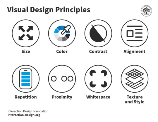
Size – Users notice larger elements more easily.
Color – Bright colors typically attract more attention than muted ones.
Contrast – Dramatically contrasted colors are more eye-catching.
Alignment – Out-of-alignment elements stand out over aligned ones.
Repetition – Repeating styles can suggest content is related.
Proximity – Closely placed elements seem related.
Spacing - giving elements more space and room to breathe will make it easier for the viewer to identify all objects in your design and order them by importance.
Whitespace – More space around elements draws the eye towards them.
Texture and Style – Richer textures contrast to flat ones.
Typographic hierarchy - a system used to organize in a visual way using typography.
0 notes
Text
Beginner to Pro: Top UI/UX Design Tricks You Need to Know

Introduction
UI/UX design plays a crucial role in crafting user-friendly digital experiences. Whether you're starting your journey in UI/UX or aiming to enhance your skills, mastering the right tricks can set you apart. In this blog, we'll explore essential UI/UX design tips that can help you transition from a beginner to a pro.
1. Understand Your Users
Before you start designing, it's essential to know your users. Research their preferences, behavior, and pain points. Conduct user testing and surveys to gather insights. A strong understanding of user needs leads to a more intuitive design.
2. Keep It Simple and Intuitive
A cluttered interface confuses users. Stick to minimal design principles by using whitespace effectively and ensuring that navigation is easy. A well-structured UI makes interactions smooth, improving user satisfaction.
3. Master Typography and Color Theory
Typography and color are powerful tools in UI/UX design. Use fonts that are readable and align with the brand personality. Colors should be strategically chosen to evoke emotions and improve usability. Contrast is key for accessibility.
4. Mobile-First Approach
With a significant number of users accessing websites and applications through mobile devices, designing with a mobile-first approach is essential. Ensure that the interface is responsive and adapts seamlessly across different screen sizes.
5. Focus on Microinteractions
Microinteractions, such as button animations, hover effects, and subtle transitions, enhance user experience by making interactions feel engaging and natural. They provide feedback and guide users through the interface effortlessly.
6. Prioritize Loading Speed
Slow-loading websites and applications drive users away. Optimize images, use compressed files, and implement caching techniques to improve performance. A fast-loading UI keeps users engaged and enhances usability.
7. Utilize UI/UX Design Tools
Leverage powerful design tools like Figma, Adobe XD, and Sketch to create wireframes and prototypes. These tools allow designers to visualize ideas and collaborate efficiently.
8. Stay Updated with UI/UX Trends
UI/UX is an ever-evolving field, and keeping up with trends is vital. Follow industry experts, take up courses, and experiment with new design patterns to stay ahead of the competition.
9. Get Certified and Build a Portfolio
Enrolling in a UI UX design certification in Yamuna Vihar or UX UI design training in Yamuna Vihar helps solidify your expertise. A strong portfolio showcasing your work can significantly boost your career prospects.
10. Learn Web Development Basics
A solid understanding of Web Designing Training in Yamuna Vihar or Web Development Training Institute in Yamuna Vihar can complement your UI/UX skills. Knowing HTML, CSS, and JavaScript helps designers create functional prototypes and work efficiently with developers.
Conclusion
UI/UX design is an exciting and dynamic field that requires continuous learning and creativity. By implementing these strategies, you can refine your skills and deliver exceptional user experiences. If you're looking to enhance your expertise, consider enrolling in a UI and UX design course in Yamuna Vihar or Full Stack Web Development Training in Uttam Nagar to gain hands-on knowledge and industry exposure.
Start your journey today and transform into a professional UI/UX designer. Visit Us.
Suggested Links
Oracle Database Administration
MY SQL Training
PHP Development
#ui ux design#html training#css tips#java programming language#full stack development#web design#web development
0 notes
Text
UI/UX Design

User Interface (UI) and User Experience (UX) design play a crucial role in the success of websites and applications. They ensure that digital products are not only visually appealing but also functional and easy to use. In this post, we’ll break down the key concepts of UI/UX and how you can start learning them.
What is UX Design?
UX (User Experience) design is the process of creating products that provide meaningful and relevant experiences to users. It focuses on the user's journey — how they feel when interacting with a product, how easy it is to use, and how well it solves their problems.
Core Elements of UX Design:
User Research: Understanding user needs and behaviors through interviews, surveys, and testing.
Wireframing: Creating low-fidelity layouts to map out structure and flow.
Prototyping: Building interactive versions of a design for testing.
Usability Testing: Observing real users as they interact with your product.
What is UI Design?
UI (User Interface) design focuses on the look and feel of a product — the visual and interactive elements that users engage with. It includes typography, color schemes, button styles, icons, and layout.
Core Elements of UI Design:
Visual Design: Aesthetic appeal through color, spacing, and graphics.
Consistency: Ensuring uniformity in buttons, fonts, and navigation.
Responsiveness: Designing interfaces that adapt to different devices and screen sizes.
Accessibility: Making designs usable for people with disabilities.
Difference Between UI and UX
While they are closely related, UI and UX are not the same:
UX: How a product feels. It’s about solving problems and user satisfaction.
UI: How a product looks. It’s about visual and interactive design.
Popular Tools for UI/UX Design
Figma: Collaborative interface design tool.
Adobe XD: Design and prototype tool for UI/UX.
Sketch: UI-focused vector design tool (Mac only).
InVision: Prototyping and collaboration platform.
Balsamiq: For quick wireframing.
Best Practices for UI/UX Design
Design with users in mind — always solve a real problem.
Keep interfaces clean, minimal, and intuitive.
Use consistent navigation and visual elements.
Make use of whitespace to avoid clutter.
Ensure your design is responsive and accessible to all users.
Start Learning UI/UX
If you're new to UI/UX, start with these steps:
Learn the basics of design principles: color theory, typography, layout.
Study great apps/websites and what makes their UI/UX strong.
Practice by redesigning existing apps or websites.
Take courses on platforms like Coursera, Udemy, or freeCodeCamp.
Join design communities like Dribbble, Behance, and Designer Hangout.
Conclusion
UI/UX design is essential for creating products people love to use. By learning both the aesthetics of UI and the functionality of UX, you can become a valuable asset in any digital team. Whether you're a developer, designer, or entrepreneur — understanding UI/UX is a skill worth mastering.
0 notes
Text
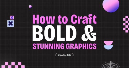
How to Craft Bold and Stunning Graphics
Introduction
Graphics grab attention, communicate effectively, and reinforce brand identity. In the digital age, visually appealing designs are key to standing out and making a lasting impression. Whether you’re creating for social media, websites, or marketing materials, becoming proficient in graphics can take your visual communication to the next level. Here are key tips to create effective and beautiful graphics.
Know Your Brand Identity: Design with Purpose
Each graphic must reflect your brand’s voice and message.
Steps to Determine Brand Identity:
Determine the core values of your brand and target audience.
Select a common color scheme and font.
Establish a distinctive look that communicates your brand personality.
A defined brand identity ensures all your graphic designs tie together and become recognizable.
Employ Bold Colors: Make a Statement
Vivid colors get attention and elicit feelings.
Techniques for the Use of Bold Colors:
Designate a leading bold color symbolizing your brand.
Apply complimentary colors for contrast and equilibrium.
Don’t overdo designs with excessively bright colors.
Purposeful color selection delivers visual impact and keeps things in harmony in your graphic design.
Typography Matters: Select Fonts Carefully
Strong typography delivers better readability and personality.
Typography Best Practices:
Select strong, readable font styles for headlines and main messages.
Use no more than two or three font styles for readability.
Make text stand out from the background.
Strong typography boosts message clarity and visual appeal in your graphics.
Add High-Quality Visuals: Boost Your Design
Clear, high-resolution photos and graphics enhance graphic design quality.
Choosing the Best Images:
Utilize professional-grade pictures and vector elements.
Visuals must complement your brand and message.
Optimize for digital or print without diminishing quality.
Good-quality visuals create more engaging and professional graphics.

Prioritize Clarity: Simplify Your Graphics
Complex graphic designs can confuse and muddy your message.
Simplification Methods:
Prioritize major content with whitespace.
Eliminate irrelevant designs or words.
Put importance on simplicity, not complexity.
Simplistic designs convey messages well and have a long-lasting effect in graphics.
Play with Layouts: Build Visual Hierarchy
A good layout directs the viewer’s attention and highlights main points.
Successful Layout Techniques:
Employ grids to control and align items.
Use larger fonts or greater contrast to differentiate important content.
Balance text and designs. A well-organized layout increases understanding and visual flow in graphic designs.
Include Motion Graphics: Dynamic Engagement
Animated graphic designs increase engagement and bring out main messages.
Tips for Motion Graphics:
Use subtle animations for transitions and effects.
Ensure animations complement the design and brand tone.
Optimize file sizes to maintain fast load times.
Motion graphics captivate audiences and enhance visual storytelling.
Getting Started with Bold Graphic Design
Define Your Design Goals:
Clarify your message and identify the desired audience response.
Gather Design Resources:
Use design tools like Adobe Creative Suite or Canva for professional-quality output.
Follow Design Principles:
Use balance, contrast, and alignment to create beautiful designs.
Test and Refine:
Collect feedback and refine designs for ongoing improvement.
Work with Design Experts:
Consult with experts to acquire bold and breathtaking graphic designs. Focal Media is experienced in designing remarkable graphic designs that appeal to people.
Conclusion: Mastering Bold and Stunning Graphics
Designing bold and beautiful graphics is a combination of creativity, strategy, and accuracy. Through brand identity, color theory, typography, and simplicity, you can create visuals that engage and communicate. For social media, branding, or marketing, graphic design makes a lasting impression.
Need professional assistance to craft striking graphics? Contact Focal Media for expert design solutions that make your brand stand out.
0 notes
Text

LE049 Shy Layers Composition For Loud Magic
Shy Layers is the musical incarnation of Atlanta-based multimedia artist JD Walsh. He made his debut recording on Hamburg’s Growing Bin Records, fusing elements of Krautrock, 80s R&B, African Highlife, Balearic Pop, and free-form modular-synth jams. This self-titled LP was named one of 2016’s top 20 Electronic records by Pitchfork. His visual artworks have been exhibited internationally. His sophomore LP Midnight Marker was released in 2018 on Tim Sweeney’s Beats in Space label. He has been profiled in Pitchfork, Stereogum, Uproxx, and The Guardian, among others.
Artist notes: Composition for Loud Magic is a work written to be heard in an exhibition of sculptures by Sonya Yong James. This exhibition occurred at Whitespace Gallery in Atlanta, Georgia in 2019. James’ work uses materials such as horsehair, cotton, clay, and silk to conjure images of dream states, ghosts, and shadows. I wanted the audio to be both reflective of this, and to be complimentary on its own. The work was written in four movements: some melodic, some textural, some with large swaths of silence, punctuated by bursts of activity. The composition weaves together manipulated found sounds, improvisations on the modular synth, and recordings made with contact microphones that were then processed in the Max/MSP programming environment. Like a lot of ambient music, the work is meant to be engaged with at any level of attention that the audience sees fit, and was originally intended to be looped and happened upon in a non-linear fashion.
I was lucky enough to meet Pauline Oliveros at a few key points during my artistic development. The first was in my early twenties, where she'd been collaborating with teachers of mine (Andrew Deutsch and Peer Bode) in a group called The Carrier Band. Being exposed to the practice of listening as a theory, especially the idea of listening as an active process, really changed the course of my thinking inexorably. With its implications for the environment, for meditation, for the body, nature, and the subconscious, I felt (and still feel) that music can not be complete without the audience/viewer/listener’s presence and participation. This has allowed me to make works in both the sonic and visual realms that are more open-ended, and less constrained by things like duration, narrative, or notions of so-called good taste. Instead, it’s allowed me to use a wider spectrum of sounds, both musical and non-musical, and to use chance and randomness in many aspects of my creative process.
0 notes
Note
To answer your theory about Omori and the closet, the black light bulb in the Headspace is synonymous with the rejections of thinking (in the popular mind, a light bulb is synonymous with an idea) therefore the white space is literally Sunny's thoughts as he forces himself to forget what he did (the toy box under the light bulb is off, a sign that he doesn't want to see what he did)
ik, HOWEVER :P I headcanon Sunny as bisexual and just think it’s fun to think of Whitespace originally being based on a repression of Sunny’s sexuality! There’s lots of evidence to suggest headspace existed before Mari fell, so why not imagine a timeline where Whitespace existed beforehand bc Sunny was bisexual and growing up in a small religious town sometime in the early 2000’s and never really learned about these things and then was scared that something was wrong with him?
#omori#I was about to type out “heavily suggested sunflower”#But tell me why tf “heavily pregnant was the top suggestion what is going on elsewhere on tumblr-#sunflower omori#omori sunflower#Sunny is bisexual#Sunny = 🩷💜💙#why am I putting so many tags ummm I’m gonna shut up lol#askbox
4 notes
·
View notes
Text
Exploring the Best Web Page Design Books for Mastering the Craft

Web design is a crucial skill in today’s digital age. A well-designed web page not only captivates users but also enhances functionality, ensuring that visitors have a seamless experience. For designers looking to hone their craft, turning to the wisdom of seasoned professionals through books is an invaluable approach. These resources offer timeless principles, emerging trends, and practical guidance, providing a roadmap to mastering the art and science of web design.
Why Books Are Essential for Learning Web Design
Books on web design go beyond quick online tutorials and articles by offering in-depth insights. They are often written by experienced designers who have spent years perfecting their craft, allowing readers to learn from real-world successes and challenges. Additionally, books provide a structured approach to topics, ensuring that foundational concepts are well-understood before progressing to advanced techniques.
Foundational Principles of Web Page Design
Effective web design starts with a solid understanding of design principles. Books that focus on web design foundations delve into concepts like typography, color theory, grid systems, and visual hierarchy. These principles help designers create layouts that are aesthetically pleasing and functional. For example, understanding the importance of whitespace and alignment ensures a clean, professional appearance, while color theory guides the creation of visually cohesive designs that resonate emotionally with users.
User Experience and Accessibility
Modern web design is not just about aesthetics; it is about creating user-friendly experiences. Books that focus on user experience (UX) design teach the importance of intuitive navigation, responsive design, and ensuring that web pages are accessible to everyone, including individuals with disabilities. These resources often emphasize the need to test designs with real users and incorporate feedback to make iterative improvements.
Accessibility, a critical aspect of web design, is another topic extensively covered in design books. From implementing proper alt text for images to creating keyboard-navigable interfaces, books provide actionable strategies to ensure inclusivity, which is not only ethical but also increasingly required by law.
Staying Updated on Web Design Trends
Web design is a constantly evolving field, with new trends emerging regularly. Books written by contemporary designers or updated editions of classic texts highlight current trends, such as minimalism, dark mode, and micro-interactions. Staying informed about these trends allows designers to create modern websites that meet user expectations and stand out in competitive markets.
However, good design is not just about following trends but understanding when and how to apply them. The best web design books teach readers to balance innovation with timeless principles, ensuring designs remain effective even as trends change.
Practical Applications and Real-World Case Studies
Books often include case studies and examples of successful web designs, offering readers practical applications of the concepts they learn. These real-world examples show how theory translates into practice, giving readers the confidence to apply their knowledge to their projects.
In addition, many books provide exercises and challenges, encouraging readers to create their designs while applying the principles covered. This hands-on approach bridges the gap between theory and practice, fostering a deeper understanding of web design.
Beyond Design: Collaboration and Project Management
Creating a web page is often a collaborative effort involving developers, content creators, and clients. Books that explore the collaborative side of web design teach designers how to communicate effectively, present ideas persuasively, and work within team dynamics.
Additionally, these resources cover project management skills like setting realistic timelines, managing revisions, and delivering projects on budget. These non-design skills are crucial for a successful web design career, especially for freelance designers or those working in agencies.
Integrating SEO and Performance Optimization
A beautiful design is only effective if users can find it. Books that focus on web design often include chapters on integrating SEO (Search Engine Optimization) principles into designs. From creating SEO-friendly navigation to ensuring mobile responsiveness, these insights are essential for building websites that perform well in search engine rankings.
Performance optimization is another key area covered in many web design books. Readers learn about optimizing images, reducing load times, and implementing efficient coding practices to create fast, user-friendly websites, which can significantly contribute to bringing your site to the top-3 position in search results.
Building a Personal Design Philosophy
One of the greatest benefits of reading books about web design is the development of a personal design philosophy. By learning from a diverse range of authors, each with their unique perspective, readers can identify the principles and techniques that resonate with them. Over time, this helps designers establish their voice and style, setting them apart in a competitive industry.
Digital vs. Physical Books
While physical books are cherished for their tangible feel and easy note-taking, eBooks offer portability and often include interactive features like embedded videos or links to additional resources. Choosing between the two depends on personal preference, but either format can provide a rich learning experience.
Conclusion
The journey to becoming a skilled web designer requires continuous learning, and books remain one of the best resources for mastering the craft. Whether you’re exploring foundational principles, delving into UX and accessibility, or staying updated on trends, the insights offered by the best web page design books can guide you at every stage of your career.
By investing time in these resources and applying what you learn, you can elevate your designs, creating websites that are not only visually stunning but also highly functional and impactful.
#seo services #seo
0 notes
Text
A Deep Dive into UI Design: Best Practices and Trends
User Interface (UI) design is a crucial aspect of digital product development, focusing on the look and feel of applications and websites. A well-crafted UI not only attracts users but also enhances their interaction with the product. In this blog, we’ll explore the key principles of UI design, best practices, and emerging trends that every designer should consider.
Understanding UI Design
UI design is about creating intuitive and aesthetically pleasing interfaces that allow users to navigate digital products easily. It involves a combination of graphic design, information architecture, and interaction design.
Key Components of UI Design
Visual Hierarchy: Organizing elements on a page to guide users’ attention. This can be achieved through size, color, contrast, and spacing.
Color Theory: Understanding how colors evoke emotions and behaviors is essential. A well-chosen color palette can enhance usability and brand identity.
Typography: Selecting the right fonts and sizes ensures readability and helps convey the brand’s voice. Consistent typography is key to a polished UI.
Spacing and Alignment: Proper use of whitespace improves readability and creates a balanced layout. Alignment ensures a clean and organized interface.
Best Practices for UI Design
1. Focus on Usability
Usability is the cornerstone of effective UI design. Always prioritize user needs and ensure that navigation is intuitive. Conduct usability testing to gather feedback and make iterative improvements.
2. Maintain Consistency
Consistency across your UI helps users understand how to interact with elements. Use a style guide to standardize colors, fonts, buttons, and icons throughout the product.
3. Use Familiar Patterns
Utilize familiar UI patterns to make interactions easier for users. Common elements like navigation bars, buttons, and forms should feel intuitive to users.
4. Provide Clear Calls to Action (CTAs)
CTAs guide users towards desired actions, such as signing up or making a purchase. Make them stand out visually and ensure they communicate a clear benefit.
5. Optimize for Mobile
With an increasing number of users accessing products via mobile devices, responsive design is essential. Ensure your UI adapts seamlessly to different screen sizes and orientations.
Emerging Trends in UI Design
1. Dark Mode
Dark mode has gained popularity for its aesthetic appeal and reduced eye strain. Offering a dark mode option can enhance user experience and cater to personal preferences.
2. Microinteractions
Microinteractions are small animations or design elements that provide feedback or enhance user interactions. They can make interfaces feel more dynamic and engaging.
3. Minimalism
Minimalistic design focuses on simplicity and functionality. Reducing clutter helps users focus on core tasks and improves overall usability.
4. Voice User Interface (VUI)
As voice-activated devices become more common, designing for voice interactions is crucial. VUI should be intuitive and integrate smoothly with visual elements.
5. Customizable Interfaces
Allowing users to customize their interfaces enhances personalization. Users appreciate the ability to tailor their experiences to fit their preferences.
Conclusion
UI design is a blend of art and science, requiring a deep understanding of user behavior and aesthetic principles. By focusing on usability, maintaining consistency, leveraging familiar patterns, and keeping up with emerging trends, designers can create interfaces that are not only visually appealing but also highly functional.
As you navigate the world of UI design, remember that the ultimate goal is to create an enjoyable experience for users. Stay curious, embrace new trends, and continue honing your skills. Happy designing
0 notes
Text
The Importance of Effective Web Design in the Digital Age
Web design is an integral part of creating an online presence, shaping how users interact with websites and how information is conveyed. At its core, web design is the process of conceptualizing, planning, and arranging content on the internet. A well-designed website is not just visually appealing but also functional, easy to navigate, and optimized for user experience. In today’s digital age, the importance of web design extends beyond aesthetics. It directly influences the usability, accessibility, and effectiveness of a website, impacting everything from user retention to conversion rates.
A major component of web design involves layout and structure. Designers must organize content in a way that is both logical and visually engaging. The arrangement of text, images, and interactive elements on a page should guide users seamlessly through the website, ensuring they can find the information they need quickly and effortlessly. For instance, navigation bars, footers, and internal links are essential in enabling users to move between different pages without confusion. Additionally, the strategic use of whitespace, also known as negative space, helps to break up content, preventing the page from feeling cluttered and overwhelming. This not only improves readability but also enhances the overall visual balance of the design.
Responsive design has become a non-negotiable aspect of modern web design. With the rise in mobile internet usage, a website must adapt to various screen sizes and devices. Responsive web design ensures that a website’s layout, text, images, and other elements automatically adjust to fit the screen size of the device being used, whether it's a desktop, tablet, or smartphone. This fluidity is essential for providing a consistent and user-friendly experience across platforms. In fact, search engines like Google prioritize mobile-friendly websites in their rankings, making responsiveness a critical factor for both user experience and search engine optimization (SEO).
The visual design of a website often serves as the first impression a user gets of a brand or business. Elements such as color schemes, typography, and imagery play a key role in creating an emotional connection with the audience. Designers typically use color theory to evoke specific feelings or convey brand identity. For example, blue is often associated with trust and reliability, making it a popular choice for corporate or financial websites, while bright colors like red or yellow can create excitement and energy, often used by entertainment or fashion brands. Typography, on the other hand, must be both visually appealing and easy to read. Designers choose fonts that reflect the personality of the website while ensuring legibility across all devices. Imagery, including photographs, icons, and graphics, further enhances the visual storytelling of a website, helping to break up text and create a more immersive user experience.
The importance of user experience (UX) cannot be overstated in web design. While the visual aspects of design are crucial, they are only one part of the equation. UX design focuses on the functionality and ease of use, ensuring that the website is intuitive and meets the needs of its users. This involves careful consideration of the user’s journey through the site, from the moment they land on the homepage to the point where they complete an action, such as making a purchase or filling out a contact form. A well-designed UX is frictionless, meaning users should be able to accomplish their goals with minimal effort. Slow load times, broken links, or confusing navigation can frustrate users, leading them to abandon the site. In contrast, a smooth and efficient UX can significantly enhance user satisfaction and engagement.
Another critical aspect of web design is accessibility. A website must be designed with inclusivity in mind, ensuring that all users, including those with disabilities, can navigate and interact with the site. This involves using best practices like ensuring sufficient color contrast for users with visual impairments, providing text alternatives for images and multimedia content for screen readers, and ensuring the site is navigable via keyboard for those who cannot use a mouse. Accessibility is not just a legal or ethical requirement; it also broadens the reach of a website, ensuring it can be used by as many people as possible, regardless of their abilities.
The role of SEO in web design should also be acknowledged. SEO refers to the optimization of a website to rank higher in search engine results, making it easier for users to find the site. A well-structured, fast-loading, and mobile-friendly site is more likely to be favored by search engines. Furthermore, the integration of keywords, alt text for images, meta descriptions, and optimized URLs all contribute to better search engine visibility. Designers must consider SEO principles from the very beginning of the design process, as a poorly optimized site can hinder its chances of attracting traffic.
Web design is a constantly evolving field, driven by changes in technology, user behavior, and design trends. The rise of artificial intelligence, augmented reality, and voice search is shaping the future of web design, demanding new approaches to how websites are built and interact with users. Despite these advancements, the fundamental principles of good web design remain the same: creating a visually appealing, functional, and accessible website that meets the needs of its users. As the digital landscape continues to grow and change, web designers must adapt to stay ahead of the curve, always prioritizing the user experience above all else.
0 notes
Text
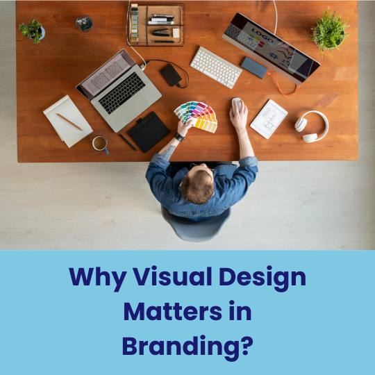
The Essential Elements of Effective Visual Design in Modern Branding
Strong visual design is crucial for brands today. It requires creating a visual language that resonates with audiences and conveys core values. Brands must embrace innovative design techniques that align with current aesthetic trends. Effective visual design encompasses elements like typography, color theory, imagery, and layout to construct cohesive visual narratives that bolster brand recognition. Additionally, digital platforms influence design strategies, necessitating adaptability and consistency across various media channels. By grasping these key components, brands can craft compelling identities that captivate attention and sustain consumer interest.
Cohesive colour palettes enhance brand recognition and emotional connection with target audiences.
In visual design, cohesive color palettes are crucial for creating a consistent brand identity that resonates with audiences. A unified color scheme improves brand visibility and recall, making it easier for consumers to associate certain colors with specific brands. This consistency enhances brand recognition and reinforces its personality and values, making it more relatable to consumers. Colors also evoke emotions and can impact consumer behavior. By choosing a color palette that aligns with their message, companies can foster a deeper emotional connection with their audience, ultimately boosting customer loyalty and engagement. In conclusion, well-chosen colors are vital for building strong brand recognition and fostering lasting customer relationships.
Consistent typography establishes brand identity and improves readability across various visual platforms.
Consistent typography in visual design is key for establishing a brand's identity and readability. By using the same typeface and font hierarchy, brands create a cohesive visual style that helps with brand recognition and loyalty. This uniformity ensures clear messaging and accessibility for effective audience engagement on various platforms. Good typography enhances readability and user experience by guiding the reader's eye and reducing visual clutter. Overall, investing in consistent typography improves the impact of visual design and reinforces a brand's voice.
Strategic layout guides viewer attention, ensuring key messages are effectively communicated and understood.
Strategic layout in visual design is essential for directing viewer attention towards important messages and creating a clear visual hierarchy. Principles like balance, alignment, and proximity help organize elements effectively, while whitespace and visuals support the text to make the message clearer and more impactful. A well-designed layout strengthens brand messaging by providing a cohesive visual experience that resonates with the audience, leading to a lasting impression. Prioritizing viewer attention through careful arrangement helps brands communicate their key messages effectively.
Effective visual design is essential for modern branding as it helps create a strong identity that appeals to the audience. Consistency in colors, fonts, images, and layouts is key for building this identity. In the digital world, adaptability and consistency are vital for improving visibility and forming stronger bonds with consumers. Investing in smart visual design is crucial for standing out and succeeding in today's fast-paced environment, leading to greater loyalty and engagement.
Visit: VS Website See: VS Portfolio
0 notes